Last month we discussed how visibility in signage is affected by letter height. While the article discussed the size and only touched on color and fonts, one thing was clear, color influences mood, visibility, and brand.
When you’re trying to engage with and connect with clients and potential customers, it’s important to make sure your brand stands out from the crowd. Your slogan, company name, and products all matter, but so do the colors you select for your signage. In fact, your signage is one of the first things clients will notice about your organization, which is one of the reasons you need to ensure the color contrast you select makes your words stand out as much as possible.
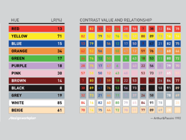
To help with your decisions, we’ve included a simple color chart from Arthur & Passini’s 1992 book “Wayfinding: People, Signs, and Architecture”. And, while the chart is helpful, and our team of in-house designers can coach you and create samples, here are some things you need to know that can influence your decision.
How color affects visibility
Visibility is one of the most important aspects of creating a quality sign that will draw in customers. People need to be able to see what your sign says even from a distance. They may even need to see them when driving down the highway at 50 miles per hour. When you’re selecting colors for your signage, consider the potential distance between the person and the sign. If you’re trying to reach people who are far from your sign, the colors will need to have a higher contrast than those who simply walk directly in front of it. Note that you may need to choose different color combinations for different types of signs in order to have the highest level of visibility for your clients.
How color affects mood
Keep in mind that color combinations can affect the viewer’s mood, according to website DesignWorkPlan.com. Think about such popular brands as McDonalds or KFC. What colors are typically used for fast-food restaurants? Getting hungry? There is a reason why. When for example, the color black is often associated with power and elegance. Both yellow and white lettering work well on a black background, and these color combinations are especially usable in office building signs or for indoor usage. White, on the other hand, is generally associated with goodness and light. A white background offers a lot of versatility but be careful as you choose your lettering. Make sure you select fonts and styles that emphasize the white background without being completely absorbed by it.
Again, refer to the color chart for some ideas of which colors contrast each other and the mood you want your brand to portray.
Color and your brand
As you grow and expand your company, your goods, and your services, make sure you select colors that represent your brand. It’s important to choose your branding colors early on, as these will help clients to both remember and recognize your brand. When it comes to building your client base, customer recognition is key when it comes to building trust. Consider a brand like IBM, whose logo colors are blue and white. They use the same colors consistently and frequently to create a positive view and recognition of their brand. Use that same concept throughout your stores, your communities and in your advertising.
Tips for good sign design and color usage
A few tips to end with:
- Carefully select colors that have high contrast. This will ensure that anyone walking by your company or glancing at your sign can quickly and easily see exactly what you’re offering.
- High contrast is essential when it comes to text on signs, and ensures that even at a distance, clients will be able to read your message.
- High contrast signage includes colors such as white and black, yellow and black, or yellow and purple.
- Use fonts and font sizes that are easily visible and recognizable. And consider how these colors, fonts, and styles with be portrayed
Are you ready to reach more clients, expand your brand, and grow your company? Contact FSGS. and let our experienced design team develop the right color combination for your sign packages.
Tags
Keep Reading
Thought Leadership
Seamless Custom Signage Solutions: What A Dedicated Partner Can Do For You
10 MIN READ
Thought Leadership
Weaving Signage Strategy Into Your Master Planning
10 MIN READ
News & Events
Red Elephant (AIM & N Graphic Solutions) Ranks No. 1779 on the 2023 Inc. 5000 List
10 MIN READ
Back To Blog
The Ultimate Buyers Guide
Complete the form below for a free guide you can use to prepare before our meeting.